
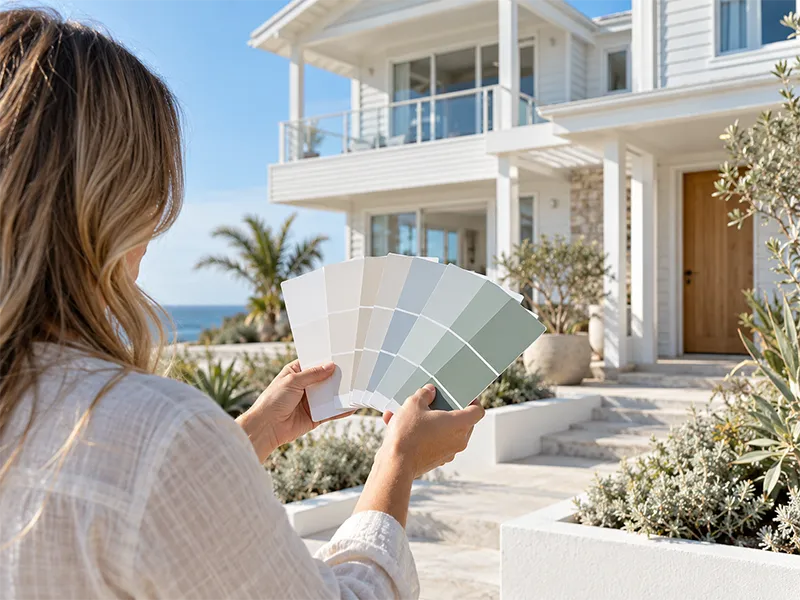
Exterior colour is a bigger commitment than interior. You will live with it for the better part of a decade, your neighbours will see it every day, and getting it wrong is expensive to undo. The good news is that most of the decision comes down to a few practical factors rather than taste alone, particularly on a coastal block where light and weather do things they do not do further inland.
Start With What You Cannot Change
Before looking at a single swatch, take stock of the elements that are staying put. The roof is the big one, whether that is terracotta, a charcoal Colorbond, or older concrete tiles. Then there is brickwork you are not painting over, stone or timber features, the driveway, window frames, and often a fence or retaining wall.
These fixed elements set the boundaries of what will work. A warm terracotta roof pushes you toward warmer wall colours and fights against cool blue-greys. A dark charcoal roof opens up a much wider range. Dulux’s own guide to choosing an exterior scheme makes a similar point about materials, noting that warm earthy tones sit naturally with timber and clay, while cooler greys and blues suit concrete.
Work outward from those fixed pieces rather than picking a wall colour you like and hoping the roof cooperates.
Coastal Light Changes Everything
This is the part people underestimate. Light near the water is brighter and more reflective than it is a few suburbs inland, and it bounces off the house from more directions. A colour that looked soft and muted on a swatch indoors can read almost white on a sunlit wall at Terrigal or Avoca Beach.
The practical effect is that mid-tones tend to hold their character better outdoors than very pale ones. A colour you think is a gentle grey may wash out completely. Going a shade or two deeper than feels right on the swatch is a common correction.
Aspect matters too. North and west-facing walls cop the most sun through the day and will read lighter and warmer than the same colour on a shaded south wall. On a house with a strong aspect difference, it is worth looking at your samples on both sides before deciding.
The Dark Colour Question
Deep charcoals and near-blacks have been popular on Australian facades for years now, and they do look sharp. There are two things worth knowing before committing.
First, dark colours fade and chalk faster than light ones under strong UV, and coastal UV is strong. Second, they absorb more heat, which puts the coating itself under more stress and can make a west-facing wall noticeably warmer.
Neither rules them out. Paint manufacturers have responded with products aimed specifically at this problem: Dulux’s Weathershield ColourGuard range is formulated for dark colour fade resistance and uses reflective pigments that, according to Dulux, reflect a portion of visible and infrared light so the coating heats up less. Their durability claims are the manufacturer’s own rather than independently verified, so treat the specifics with the usual caution, but the general point holds: if you want a dark exterior on a coastal home, the product you choose matters more than it would for a mid-tone.
Trims, Doors and the Three-Colour Rule
Most successful exterior schemes use three colours: a main wall colour, a trim colour for eaves, fascia and gutters, and an accent for the front door and sometimes window frames.
Keep the trim close to the wall colour for a calm, modern look, or go high contrast for a sharper, more traditional one. The accent is where you can take a risk, because a front door is cheap to repaint if you change your mind in two years.
One thing worth watching on a coastal house: white trims that look crisp on day one can show salt residue and grime faster than a slightly warmer off-white. It is not a reason to avoid white, just a reason to expect a wash now and then.
Testing Samples Properly
Paint sample patches directly onto the house, not a card held up against it. Make them large, at least A3 sized, and put one on each main aspect. Look at them in the morning, at midday and late in the afternoon, and again on an overcast day if you can wait for one.
Dulux also recommends testing whites specifically with a sample pot, since undertones shift noticeably against surrounding surfaces and planting. On a coastal block with a lot of green around it, that shift can be significant.
Resist deciding on a bright Saturday afternoon. The colour you see then is the colour at its most flattering.
A Note on Heritage and Local Character
Some pockets of the Central Coast have older housing stock where a sympathetic scheme looks better than a contemporary one, and a small number of properties sit in conservation areas with controls on external finishes. If your place is older or you are unsure whether anything applies to it, it is worth a quick check with Central Coast Council before you commit to a scheme.
Related Reading
- 2026 Interior Paint Colour Trends for Central Coast Homes, worth coordinating with your exterior if the two spaces connect visually
- How Often Should You Repaint Your Home on the Central Coast?, how long an exterior scheme realistically lasts near the water
Want a Second Opinion Before You Commit?
Choosing a scheme is easier with someone who has seen how colours actually weather on local homes. Give the team at ECE Paint Crew a call on 0423 526 896 or get in touch through our contact page. We can talk through what suits your roof, your aspect and your street as part of quoting your exterior repaint, and tell you honestly if a colour you are set on is going to give you trouble down the track.